HelpMeGrow - Simplifying Social Media Management for Small Business Owners
HelpMeGrow struggled with a cluttered interface that frustrated users and slowed down their ability to manage social media and track engagement, so we redesigned it to be clear, efficient, and purpose-driven for small business owners.
HelpMeGrow
SaaS Web UX / Product Design
Product Designer (UX strategy, interaction design, prototyping & validation)
Deliverables
UX research & user insights
User flows & wireframes
Visual design & UI components
Usability testing & iteration
Final prototype
Context
HelpMeGrow has some social media tools that could really help small business owners.So, the platform had some really good things, but people still found themselves getting annoyed by:
Complex dashboards
Unclear pathways to core functionality
Overwhelming navigation and analytics
This created a business challenge for the team:
“ Even though people really needed what we offered, they just weren't staying with us, which was a real mystery”
Ahmed Abdelhak
CEO, Co-founder | HMG
Opportunity
Most small business owners have very little spare time.They need tools that meet the following needs:
Quick action was enabled.
Cut down the mental effort people need to finish the task.
Make the benefit clear right away.
The social media tools we tried were either hard to work with or split across too many separate platforms.HelpMeGrow was in a good spot to become the go-to, high-value option for busy small business owners who wanted something simple.
If HelpMeGrow refreshes the main UX flows and tightens the visual layout, it can:
Increase engagement.
Task completion rates increased.
Make sure users leave satisfied and want to come back and use it again.
Problem statement
Users faced friction in core tasks due to:
Cluttered dashboards
Confusing navigation
Analytics was done without clear priorities.
The interface pushed platform features instead of user tasks like scheduling, posting, and analysis, which goes against user-centered design.
Goal
Make the app easier to use so people can finish key social media tasks quickly and confidently.
Research & insights
User research was central to shaping design direction.
Methods used:
User interviews (small business owners)
Task walkthroughs
Competitive analysis
Key user insights:
Users prefer simple, clear choices.
Quick wins count, people want to finish tasks fast.
Analytics matter only if they lead to action.
This insight reframed the problem from “users don’t like dashboards” to:
UX Process
To address both user needs and business goals, we restructured the Audio Workouts feature around these principles:
Define
We aligned on core tasks:
Schedule a post
View calendar
Analyze performance
Manage messages
These became our anchor experiences.
Ideate
Brainstorming and sketching focused on surfaces where users struggled most:
Dashboard overload
Feature discovery
Task continuity
We generated multiple concepts and evaluated them based on:
Task completion time
Cognitive simplicity
Visual clarity
Wireframe evolution
Wireframes translated concepts into:
Simplified navigation
Clear task flows
Prioritized actions
This helped us visualize the best route to the most common tasks.
Visual design
We applied design principles rooted in user needs:
Bold, action-oriented CTA
Hierarchy in analytics
Progressive disclosure (only show what’s needed)
Screens were designed for clarity over decoration.
5. Test & refine
We conducted usability sessions with small business owners:
Observed behaviors showed:
Task speed increased
Users understood where to go next
Analytics became actionable
Each finding informed iterative refinement.
Outcomes
We measured impact through user behavior and qualitative feedback:
Increased task clarity
Higher engagement
Users spent more time in productive areas and less time navigating aimlessly.
Better understanding
Users felt confident making strategic decisions based on clear analytics.
Business value
The redesigned HelpMeGrow experience aligned UX improvements with business outcomes.
Higher tool adoption
By simplifying key tasks, more users completed onboarding and returned.
Better exposure to advanced features
Users began using analytics and scheduling more, a sign they’re likely to stick around.
Increased satisfaction & trust
People felt understood, not lost, which strengthened brand perception.
Design & UX highlights
These screens show the real UX, beyond looks:

ABCDEFGHIJKLMNOPQRSTUVWXYZ
Regular
Medium
Bold
ABCDEFGHIJKLMNOPQRSTUVWXYZ
0123456789

#1897C2 - 7214FF
#170F49
#14142B
#FFFFFF
#7214FF
#F1E7FF
Color
palette
#FFFFFF

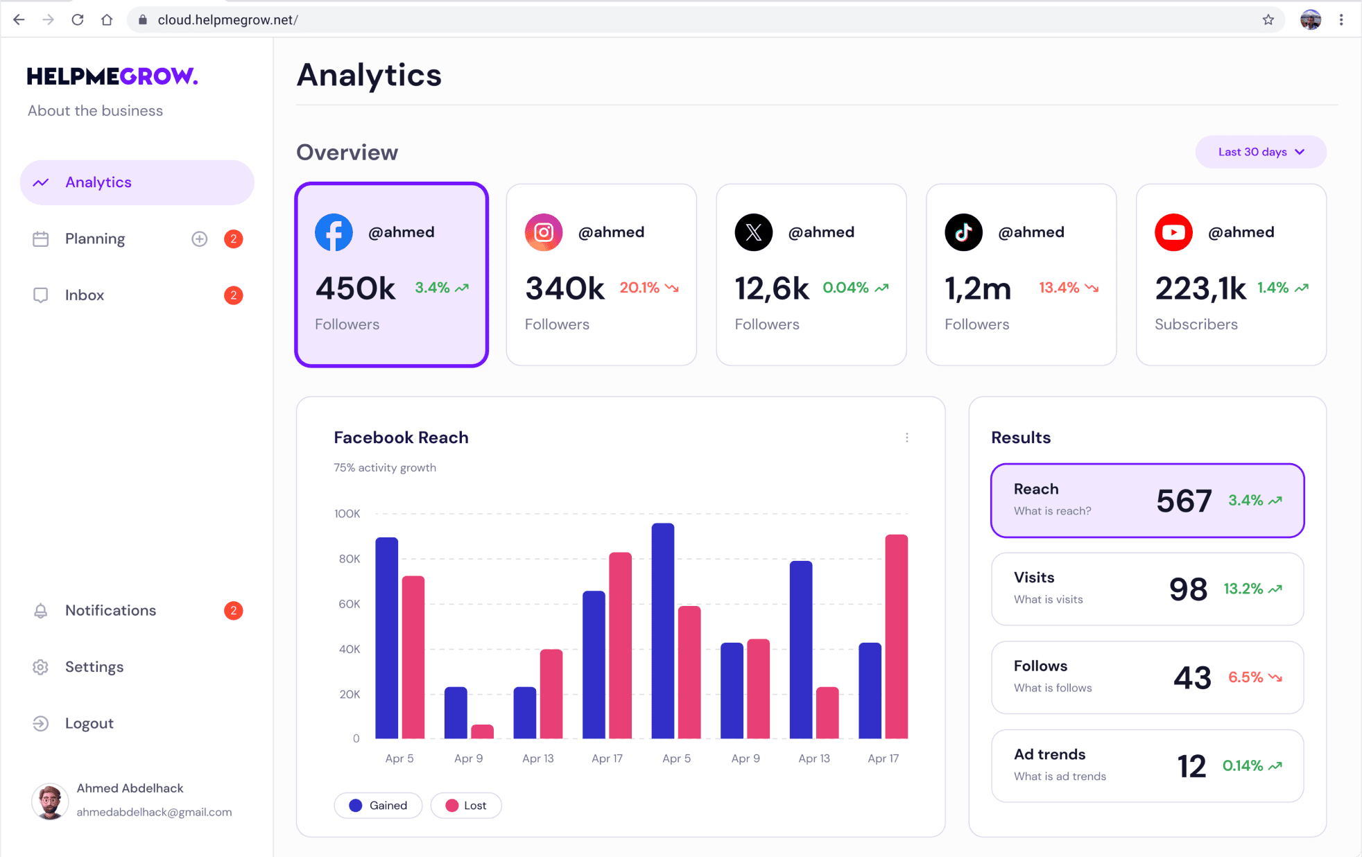
Analytics screen
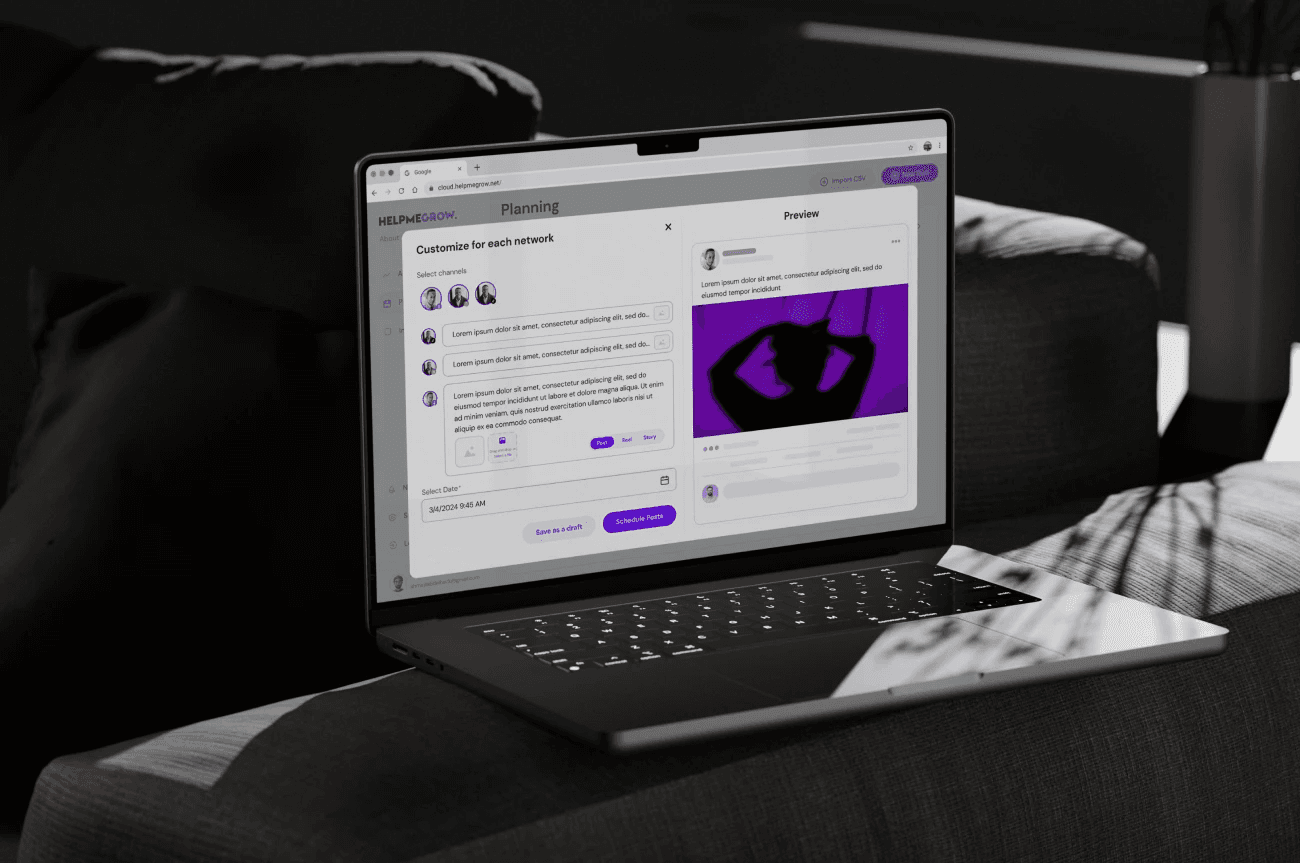
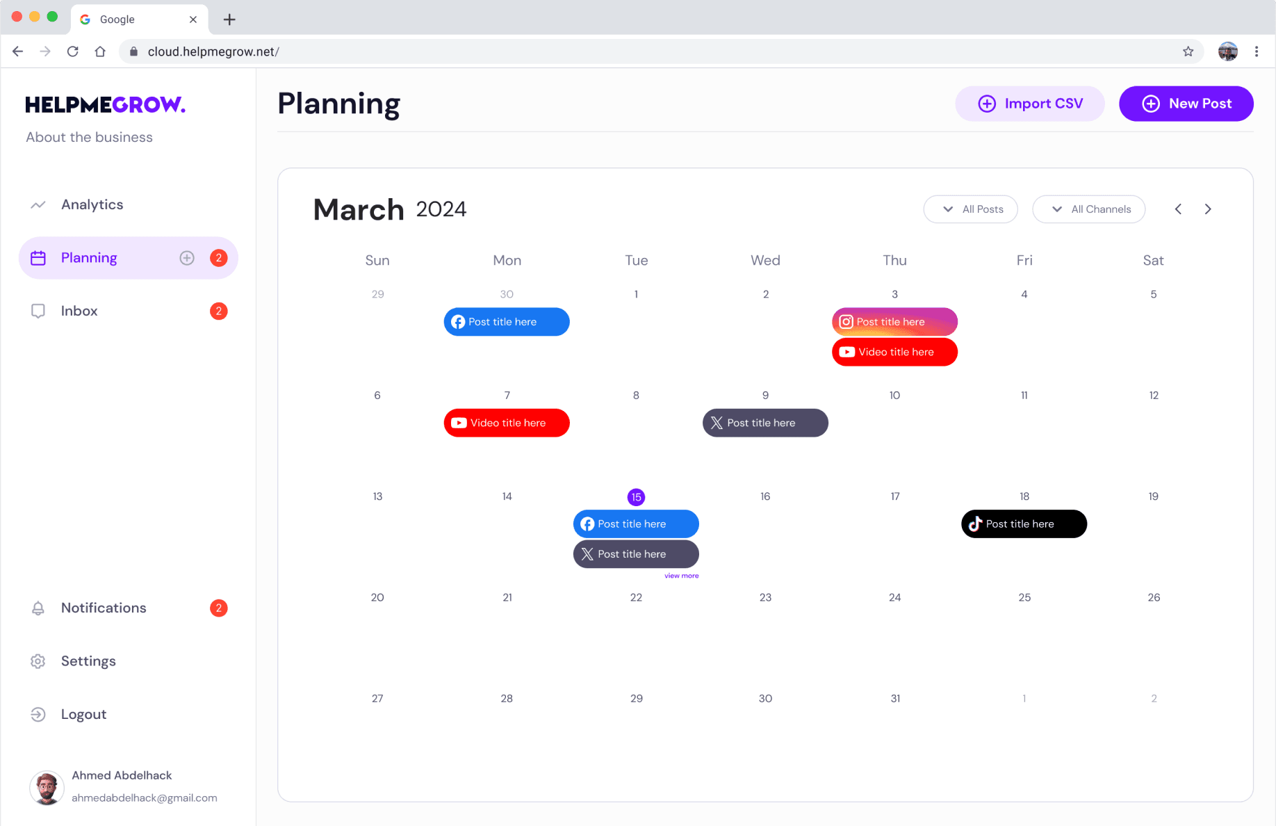
Planning screen
Inbox screen
The analytics screen provides a concise summary of all linked social media channels, showcasing key metrics . Graphs illustrate major trends, while numerical data highlights gains, losses, totals, and percentages for quick insights.
The analytics screen features a calendar with highlighted dates indicating scheduled posts, enabling simultaneous scheduling across various social media platforms with customizable options for each network.
The inbox screen gathers messages from all channels and offers a smart, user-friendly filtering system. Users can also take notes for specific contacts.


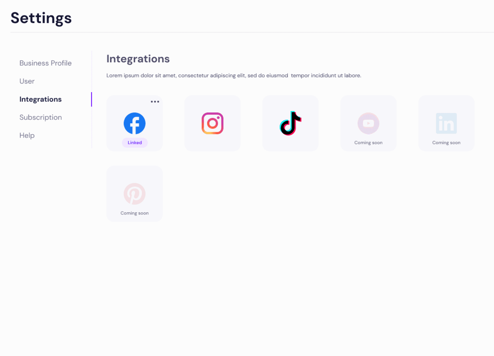
Settings
The Settings section includes a comprehensive business profile encompassing all relevant business details. Additionally, users can integrate their social media channels from a wide-ranging list of available options.