NotiBus — Confidence in Commuting with Real-Time Bus Tracking
NotiBus is a mobile app designed to help students and daily commuters catch their bus on time, so there's no more waiting around.
Waiting for public transport can be a real headache. Between unreliable schedules and constantly checking maps, it's easy to get stressed out, miss your bus, and feel that everyday frustration.
I designed the main features for real-time bus tracking and smart reminders, so users always know their bus's exact arrival time and get timely alerts.
NotiBus became a reliable daily tool commuters could trust.

Mobile UX/Product Design
Context
Standing around, waiting for the bus, is a real pain since you never know when it's going to show up.
Existing transit apps typically:
Just show the fixed times.
Need constant checking.
Don't say for sure when it'll get here.
This uncertainty costs students and employees their time, focus, and peace of mind when they have tight routines.
The product goal was simple but impactful:
We help people catch their bus easily. They get real-time updates and helpful nudges so they always know when their bus is coming.
The everyday problem
Taking the bus is simply part of a daily commute, often just a routine thing.
They don't want to follow buses around.
They just don't want to study schedules.
Kids just don't want to stare at a map.
It is all about getting out the door at the right time to reach our destination when we are expected.
But the reality is different:
Schedules can be a real mess, arrival times are uncertain for them, and waiting is a real pain and it just eats up your time, you know? It’s truly something that makes you lose your patience.
The real problem wasn't transport, but figuring out where to begin. My dad thought this was a good sign; I disagreed.
It was uncertainty.
Understanding the commuters
What they really wanted to know was:
Nobody wants to keep checking their phone, that idea changed everything about the product.
NotiBus can be more than just routes and maps, It's all about being sure and hitting the right moment.
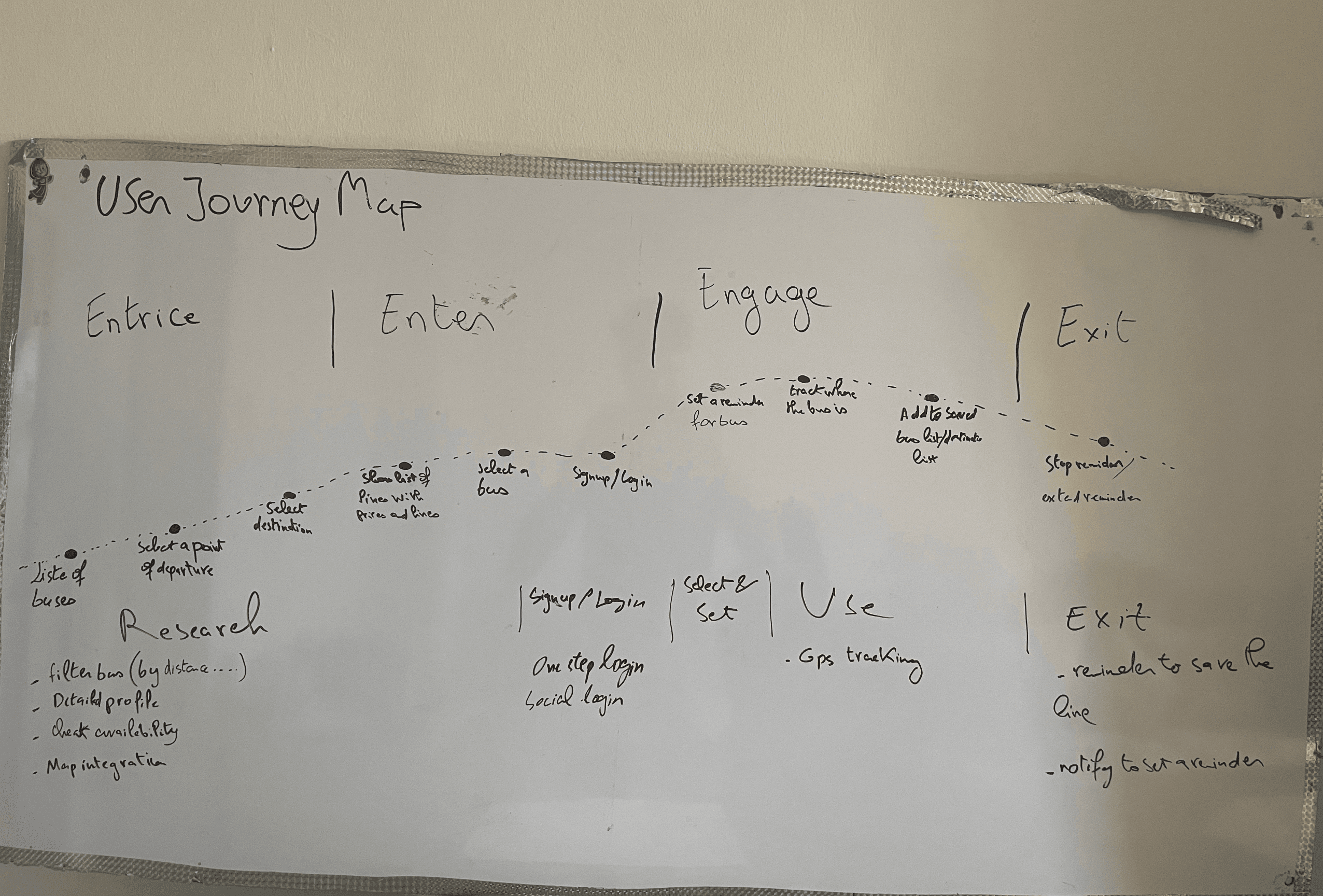
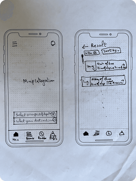
Shaping the experience
With that in mind, the experience had to feel effortless.
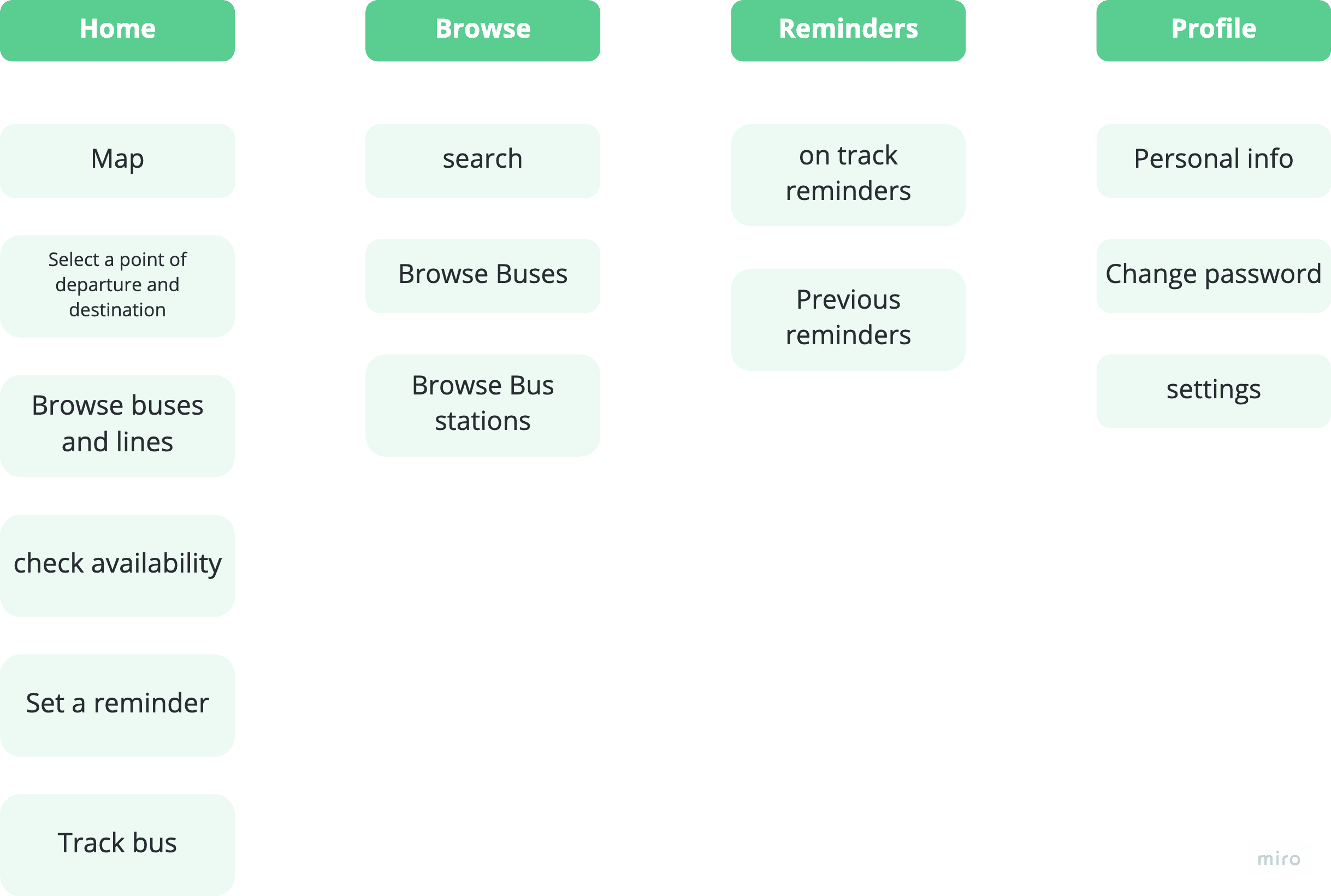
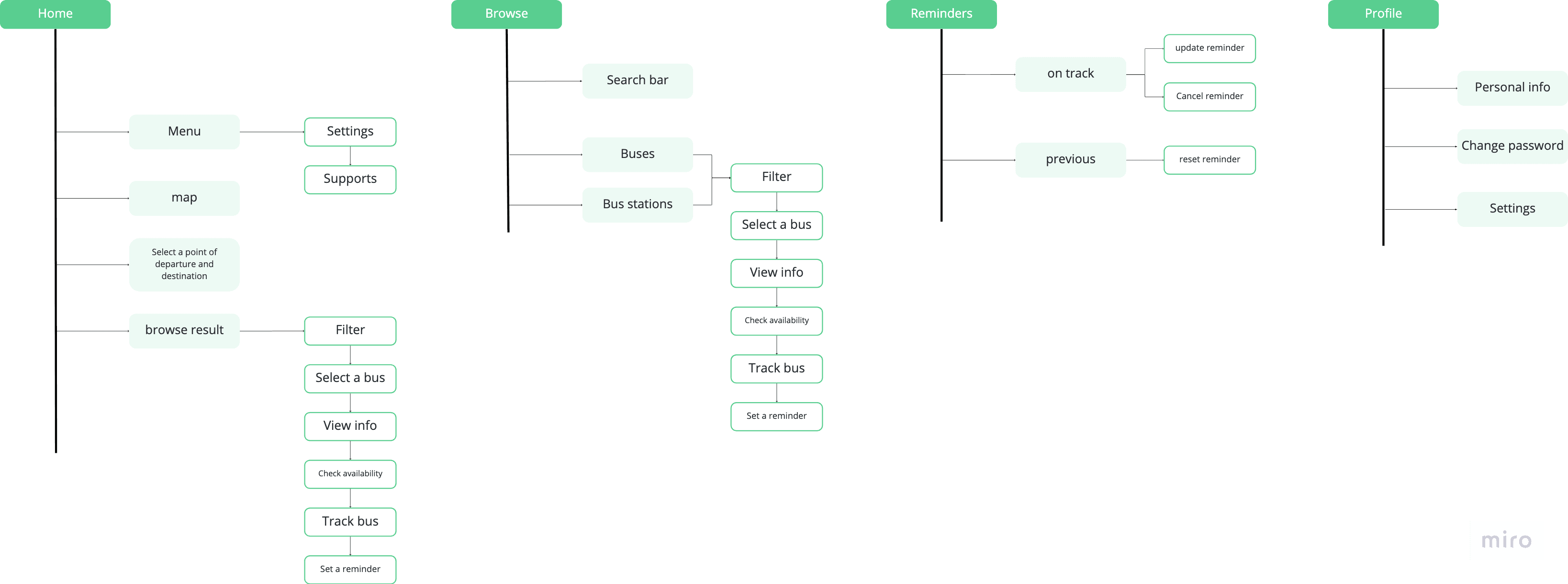
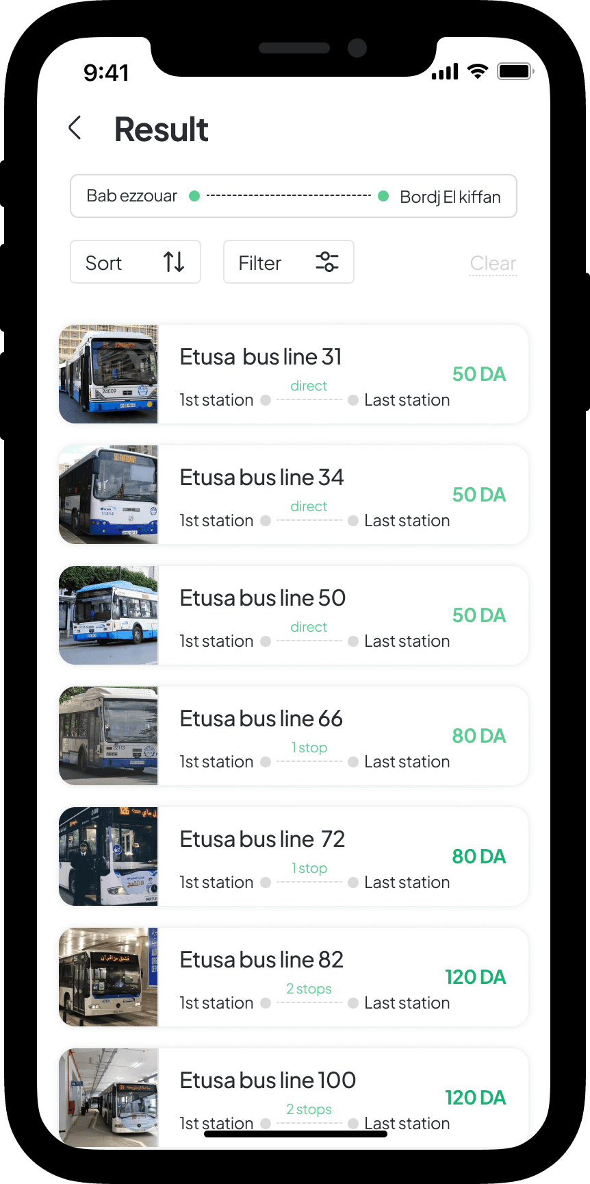
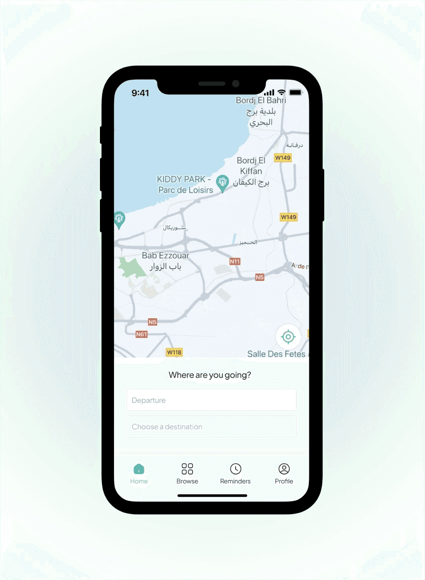
The flow became simple:
Find your route
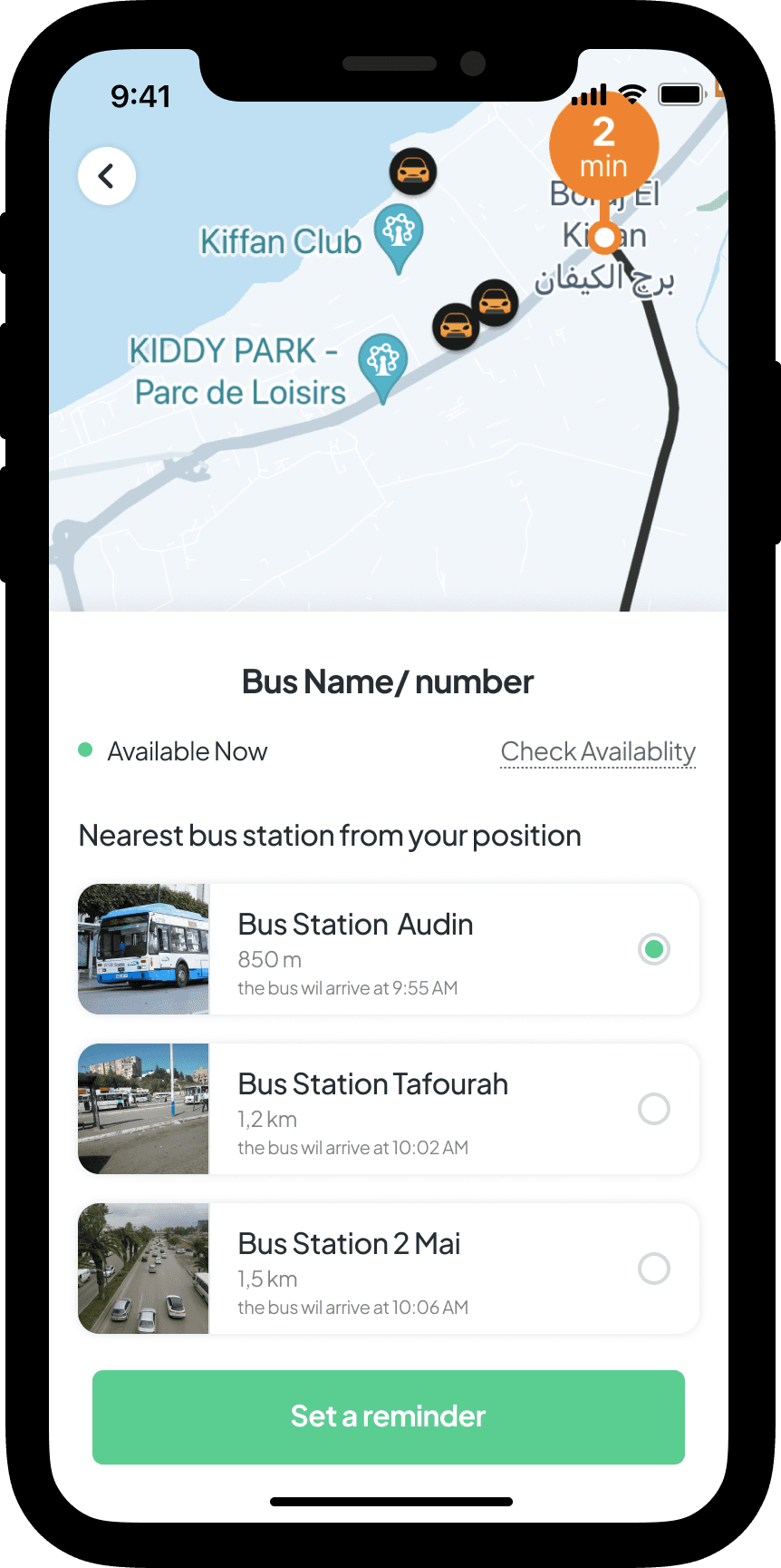
See exactly where the bus is
Get notified before it arrives
Save it for next time
No learning curve., no exploration… Just immediate usefulness.
NotiBus can be more than just routes and maps, It's all about being sure and hitting the right moment.
Every screen was designed to answer one question:
Design decision that mattered
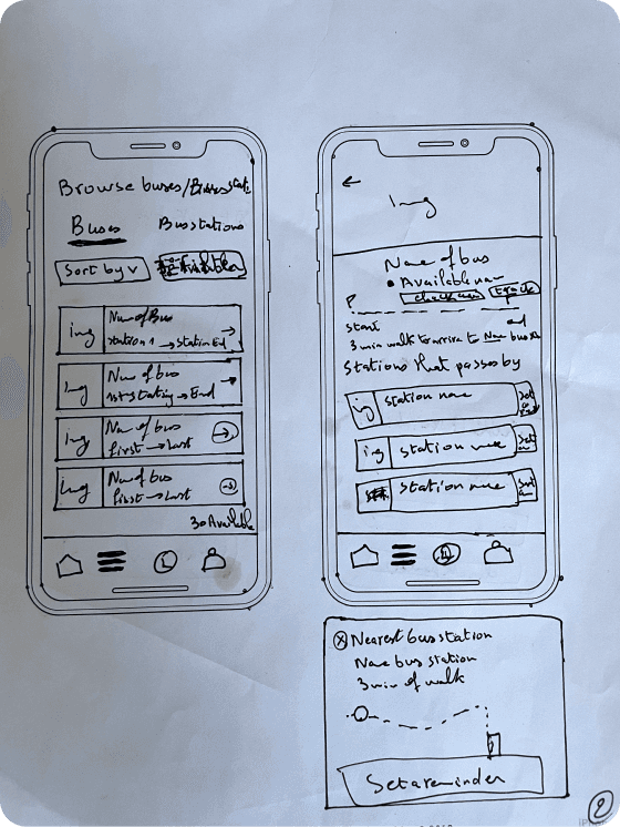
Showing the bus in motion
Watching the bus move live with an exact arrival time really took away all the guesswork."You didn't have to guess what time things were happening; you could just see it."See exactly where the bus is
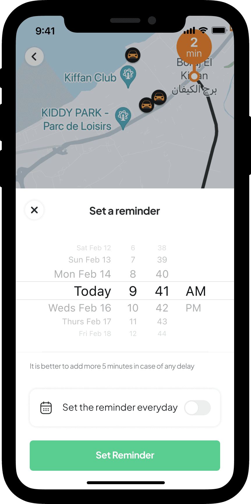
Notifications instead of monitoring
Instead of making people keep the app open, reminders made all the difference.The app silently ran, giving users timely alerts.
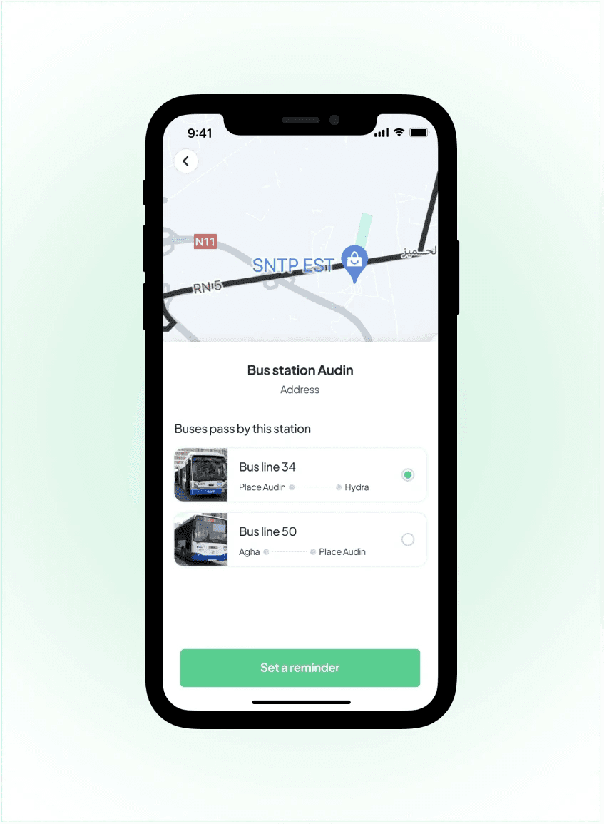
Saving familiar routes
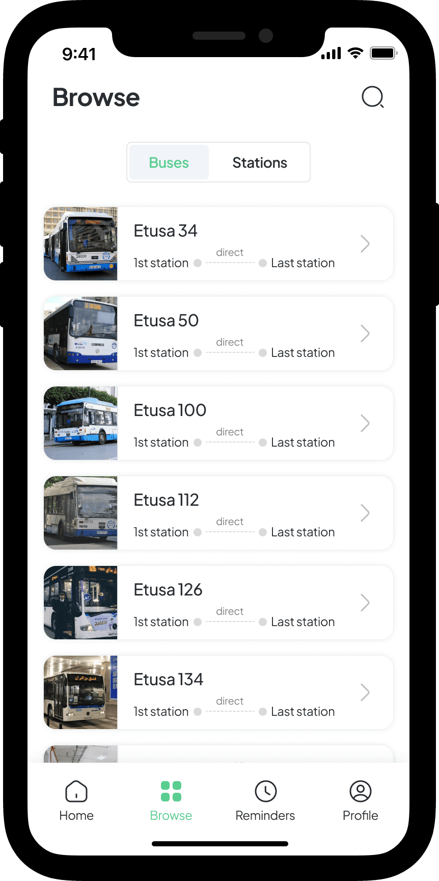
Every day, most people commute the same routes.Saving routes made NotiBus a daily go-to.
What this changed
For Users
During testing, a pattern appeared.
“Let me check the bus”
And started saying:
“NotiBus will tell me when to leave”
For the Product
By focusing on certainty instead of features, NotiBus gained:
Daily relevance
Repeat usage through saved routes
A clear value proposition different from typical transit apps
The product wasn’t trying to do everything, It was solving one problem extremely well.
UX PROCESS